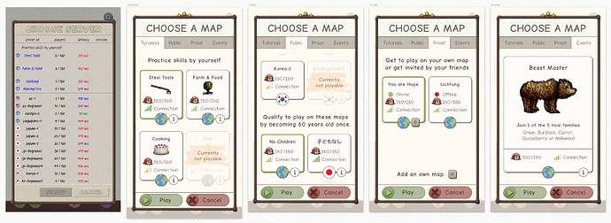
Hey Christoffer
Thanks for your hard work for the game and also for engaging with the community. I appreciate that you ask for a lot of feedback and think about improving the game constantly. I like it so much  .
.
I was thinking about the screen with the server list a lot lately. It was a confusing experience when i had to choose a server the first time. It’s a screen with a lot of information. So i had also to figure out which information are important to me and which are not. It looked very technical.
So lately i made some user research and asked people about that screen. It seems like i am not the only user who has a confunsing experience with this screen.
During my research i found out, that some words are confusing to user: «server id» and «latency in ms». Also the version and state of the server are information which are barely used. And you can barely find the events in the list.
So with the research i’ve done, i tried to figure out how we can improve this screen. Here is what i came up with:
